Tuesday, 23 December 2014
Trailer Production: Second Draft
Saturday, 20 December 2014
Production: Problems That I Encountered
Throughout the process of creating my final pieces of work I used a variety of different programs and sites, some being new to me and others I had used before.
One of the first things that hindered my production process was choosing the correct times to film and having to fit the production in with the other people involved, especially the actors. Although this proved hard at first, even if I did have to bring a few dates forward and film more on one day that I planned, everything worked out as I wanted and I was able to film everything that I intended to.
Editing the film did take longer that I thought it would as Premiere Elements is a program that is new to me, including tools that I have never used previously. Because I was inserting files that were fairly large, the program did shut down a few times while I was working but this problem was solved by me frequently saving my work so I did not lose any.
Finding the right soundtrack was also something that took longer. Without seeing my final shots put together I could not really plan exactly what music I felt fitted well. When it came the time for me to insert a soundtrack I had to try a few different ones, eventually finding three that I could edit in Audacity that would fit the style of the film and the genre.
Thursday, 18 December 2014
Sunday, 14 December 2014
Saturday, 13 December 2014
Trailer Production: First Draft
Friday, 12 December 2014
Trailer Production: Music
I have discovered an official website that allows people to share their copyright free music and allow others to use. I have found that many of the tracks from certain albums are suitable for my trailer and highlights the thriller genre. The album featured below contains songs that follow the idea of a ticking clock or counting down to something, as the characters are.
I also used 'Audacity' to edit one of the tracks so that it is much faster and sounds more like a beat, leading up to the final moments of the trailer. This is to add suspense and make the trailer seem slightly more fast paced.

I also used 'Audacity' to edit one of the tracks so that it is much faster and sounds more like a beat, leading up to the final moments of the trailer. This is to add suspense and make the trailer seem slightly more fast paced.

Thursday, 11 December 2014
Monday, 8 December 2014
Thursday, 4 December 2014
Trailer Production: 4th Dec
These are the final shots that I will use in my trailer. I have now finished my filming and can begin properly editing my film trailer together based on the planning that I have previously done.

Wednesday, 3 December 2014
Trailer Production: 3rd Dec

Although I will not be using all of these shots I have got a variety that I can choose from.
Tuesday, 2 December 2014

Sunday, 30 November 2014
Trailer Production: 30th Nov
This is the contact sheet of the shots that I have taken on the 30th of November. They are mainly shots of her being stalked by the murderer and her witnessing the murder. This is a big part of the filming done as these are important shots that build up a lot of the trailer.

Saturday, 29 November 2014
Trailer Production: Progression
I have now made decent progress with my filming and am at the stage where I can begin putting shots together. The image below shows the shots that I have filmed so far, not including some shots that I filmed spontaneously at the time of filming. I may not use all of these shots but it is likely that I will decided to use some to make my trailer flow better. After the next two filming sessions I will have hopefully completed my filming and the creation of my trailer will have begun.

Thursday, 27 November 2014
Trailer Production: 27th Nov

These are the shots I have filmed today, the 27th November. They are of the detectives working with the evidence to find Lauren. I have tried out different angles so I can find the best shot and will now be able to cut each shot to it's best part and begin to put the trailer together.
Wednesday, 26 November 2014
Trailer Production: 26th Nov

This is the contact sheet from the first day of filming. I have taken all the shots that I planned to take which means I am still on schedule. I will now be able to edit these shots and begin creating my trailer. Ever shot from this shoot is a close up and I decided to do all of these at the same time as they are all in the same location and using the same equipment. I used a tripod to keep the camera still and a torch as a spotlight to highlight the murderers mask.
Sunday, 23 November 2014
Poster Production: Final Images


These are the contact sheets from the final shoot for my poster. The only difference from the draft images is that I have taken these current ones on a different coloured background . This will make it easier to edit as I will be able to cut out the model in Photoshop as their costume/hair will not blend in with the colour behind them.
Saturday, 22 November 2014
Trailer Production: Shooting Schedule

The above image shows the schedule I have produced to help me keep on top of my filming and so I can note when I need to take certain shots. I have colour coded each shot depending on what date I will do the filming.
The following list specifies each date:
- Orange ~ 26th Nov ~ Morning
- Yellow ~ 27th Nov ~ Afternoon
- Purple ~ 30th Nov ~ Night
- Pink ~4th Dec ~ Morning & Night
Thursday, 20 November 2014
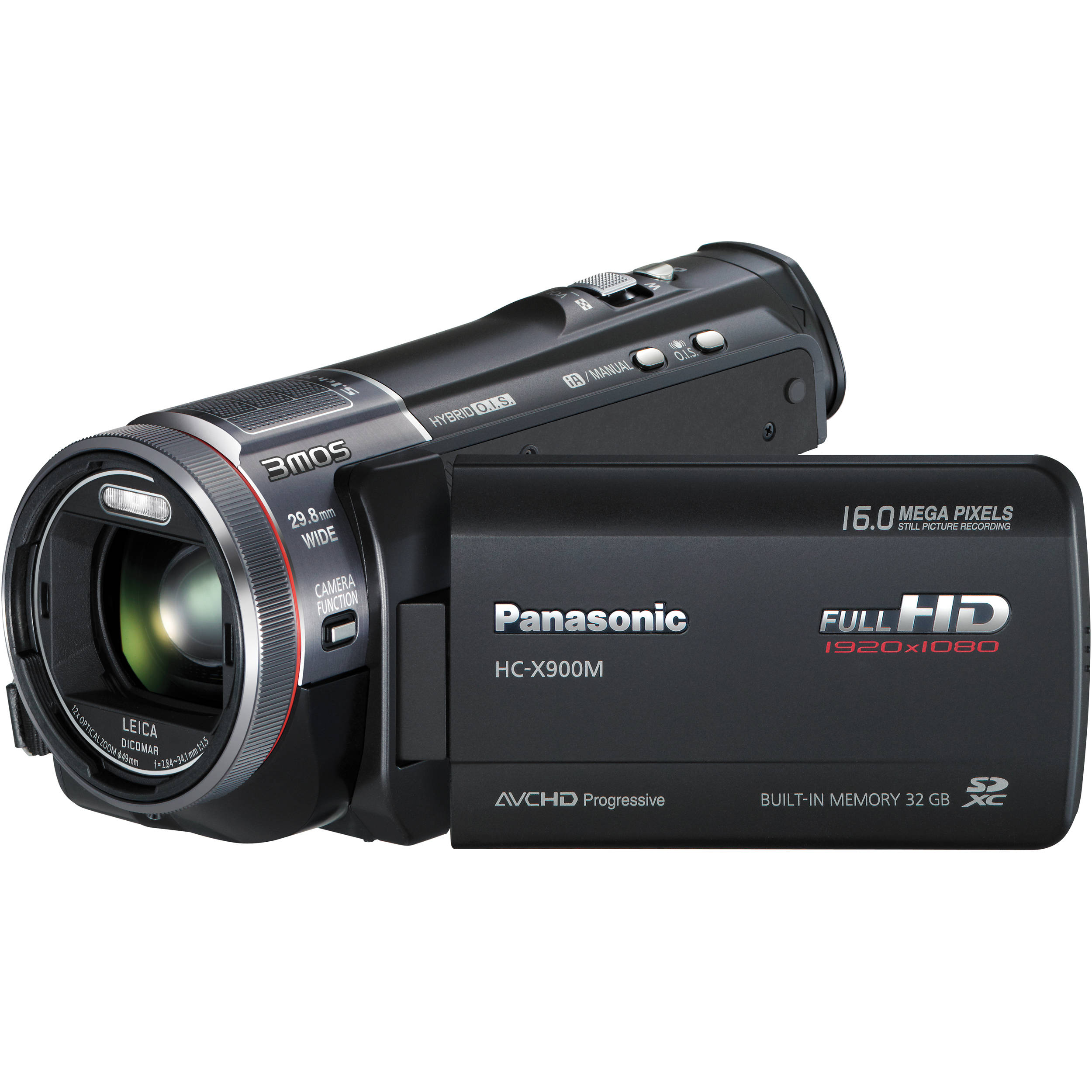
Production: Main Equipment
 The camera that I will be using to shoot most of my work will be the Panasonic HC Camcorder which will allow the quality of my work to be fairly high and for the images to be clear. I will also use a Nikon Coolpix L820 still camera to take the images for my poster and magazine cover. This camera also takes high quality shots to add to the professional look of my work. I will use a tripod for the majority of the filming and photography to keep the camera still and at the right height. As much of my filming will be done at night I will also use some lighting to enhance my shots and add a sense of fear to the overall trailer.

Tuesday, 18 November 2014
Monday, 17 November 2014
Sixth Overview: Pulling My Ideas Together
I have created this presentation as a way of pulling together all of my ideas and briefly highlighting why I have chosen to do certain things. I have covered the trailer, magazine cover and poster throughout the presentation so all of my ideas are in one place. I am now at the stage where I will be able to begin filming my trailer and taking the draft photographs and final photographs for my other two products. Across the whole of this blog I have put together all of my ideas and drafted out the majority of all three promotional products. This presentation has finally put together all of my ideas and summarised each one.
Friday, 14 November 2014
Wednesday, 12 November 2014
Trailer Planning: Making Props
These are the props that I have had to create in order to be used in my trailer. I have had to create a missing poster for Lauren that can be put up on the white board in the evidence room as an example of what the police have put around the city. I have also had to create the note that the murderer has sent to the police threatening to kill Lauren. This will also be seen in the trailer as the detectives read it. I used a website called strix.org.uk/ransom to create the note to make it look realistic and to enable me to print it from my computer. The other images further down the post are of the board in the detectives office and the door leading to the office. I have had to put together and print certain props including photographs and signs that police would work with in reality. I have done this to make my trailer seem as realistic as possible, something that is often felt within thriller films, adding to the tense mood, making the viewer think that this plot could really happen.


Tuesday, 11 November 2014
Planning: Equipment Checklist
This is the check list that I have put together as a way of organising what I need and so that I know what I must ensure I have before beginning to create my products. This will also help me organise what each actor must bring with them and what I can supply myself.
Thursday, 6 November 2014
Trailer Planning: Storyboard and Shot List
I have created a hand drawn story board to make it clear what shots I am to use and where
other elements such as transitions and inter-titles will come. It will also help me when filming and putting together my trailer as I will be able to see the basic ordering of the shots. From this, I will also be able to create an animatic using real life stills to show the order in which I will edit my trailer.
Wednesday, 5 November 2014
Poster Planning: Draft Images


This is the first set of images I have taken for my poster. I am already fairly happy with these images and I have now got an idea of what sorts of shots I will take for my final product. One of the only things I will change is the colour of the background in order to aid me when editing in Photoshop.
Tuesday, 4 November 2014
Trailer Planning: Locations
The following list is of the locations that I will use within my trailer and where I will need to carry out checks and risk assessments. I will create a report for each location to highlight why I will be using it and why it is suitable for that specific part of the trailer.
-An alley way (where she witnesses the murder)
-A house (where she goes home to report the murder to the police)
-A normal street (when she begins to feel she is being stalked and followed and where she is put into the kidnappers car)
-A bathroom (Where she is kidnapped from)
-The garage (where she is held)
-An office/room (where the detectives work to put together evidence)
Monday, 3 November 2014
Poster Planning: Production Companies

As seen in the previous post and the image above, I have included several film companies at the foot of my poster. Before including these I did some basic research into each company to ensure that they would suit the film/trailer I am to put together.
Firstly, I found that MIRAMAX FILMS, although produce films of a variety of genres, have created and distributed many well known thrillers such as 'SCREAM' and 'DERAILED'. This tells me that they are successful in producing thrillers and have a well known place within the industry. This would help sell my film and add to is success.
Secondly, I researched PARAMOUNT PICTURES. Just from hearing the names of some of their films I have learnt that they are well renowned in the industry for creating fast paced, action packed movies that have become blockbuster hits. They have also worked with well respected names such as 'DWAYNE JOHNSON' and 'MARK WAHLBERG' in creating epic films.
The last company I have included is VIACOM PICTURES'. I have chosen to include this name as it is a much smaller company compared to others like WARNER BROS and UNIVERSAL. They are known for working with many independent film makers such as myself and help to build their name in the industry.
On the far right of the footer I have included the BBFC age certificate with the 15 logo. Although this is something that is not included in all film posters, I feel that for a horror or a thriller, the age is important in helping the audience to identify the sort of content that will be shown.
Poster Planning: Digital Mock Up/Template
This is a digital mock up of my poster that I have created using Photoshop Elements based on my initial hand drawn idea. I may also use this as a template when I come to create my final product and edit the overall look even further.
I have chosen every element for a reason as I feel that certain things relate to my film and certain aspects including fonts and colours go together well.
To begin with I have used the font "Digital 7" which I downloaded from dafont.com for the film title. As this is the largest piece of text I wanted to ensure that it looked good and highlighted part of the narrative. The font is similar to that of a digital clock and within my story line, time is a key factor. This reinforces the narrative and also gives a hint to the audience, even if it is not totally obvious.
The other fonts used on the poster are all fairly plain but bold, meaning they make an impression and advertise everything featured. I have placed the names of the actors starring in the film at the top of the poster as this allows them to be seen first, attracting fans of the actors and making the film seem successful and worth seeing.
I have chosen to write the words 'coming soon' in red as this makes it stand out and helps the audience identify that it is a new film, building up 'hype' surrounding it. I have also written 'zero' in red as this word has a lot to do with the overall narrative, telling the audience that there is something to do with time or the end in the film, reinforcing the genre and adding the feeling of suspense.
The overall colours of the poster really highlight the genre that the film falls into as they are dark with a few elements being slightly brighter. The dark colours represent death and fear, something that is expected of a thriller.
I have also included small print at the very bottom of the poster as I want it to look as professional as possible. This includes the names of producers, directors, actors and companies that have been involved in creating the film. Logos can also be seen at the bottom of the page which adds to the idea of success and makes it seem even more real, like it is going to be a blockbuster film.

Sunday, 2 November 2014
Fifth Overview
I have now got to the point in my planning where I can take a look at the locations I am hoping to use to check their suitability and do a risk assessment. Without doing this I am likely to face problems when I am ready to film and need to ensure that each location is available and I will not be going against any restrictions. I am also at the point where I will need to create a storyboard/animatic of the ordering of my trailer to give me a basic idea of suitable camera shots and how they look in the locations. Along with this, I need to write a film script for the whole of my trailer, including everything that will be shown such as the characters, settings, stage directions etc.
I am currently using software such as MS Word, MS Powerpoint, Slideshare and Prezi in order to plan my work and post on to this blog but will begin using other programs including Adobe Photoshop and Premiere Elements in order to create my final products.
Saturday, 1 November 2014
Trailer Planning: Chosen Film Distributor
ICON FILM DISTRIBUTION


Icon was formed in 1999 and is one of the most leading film distribution company in the UK. The company distributes a variety of films of different genres but the majority are of the horror and thriller genre.
This is one of the reasons that I believe the company is suitable for distributing my film as it is experienced with the genre and would know how to successful sell my film.
They have produced films including '30 Days Of Night' and 'Open Graves' which contain action and fast paced editing, much like my film does. This would enable the company to support me with my film and help it become successful once released.
I also feel that the company would be willing to take on my film as they are experienced with the genre and feel knowledgeable within the area.
Magazine Planning: Strapline
The strap-line on my magazine will feature at the top of the cover in the footer. It will be a way of selling the magazine, highlighting what is featuring the magazine or how successful it its. After looking at existing products, I have decided that they strap-line should be short and snappy, grabbing the attention of the audience. Both of these strap-lines are featured in the header of the cover and really sell the magazine's success.

 The fonts used on both covers are capitalised and fairly bold, making sure they are see above the masthead and the fact that they are positioned right at the top of the page grabs out attention and is one of the first things we read as we look down the page. On the first image, the words 'preview issue' are highlighted in yellow, bringing it forward from the rest of the line. This is so that before we read the full strap-line, we read these single words. The word 'preview' gives the idea that it is the first glimpse of the film that we will get and seeing 'Harry Potter' will then draw in fans of this film saga, leading them to think that there will be a 'never before seen' preview of 'Harry Potter' in the magazine. The yellow colour also contrasts with the background, allowing the audience to really take note of what it says. The font used on the second image is fairly simple but almost appears to be lit up. This appearance fits in with the actual context of the strap-line, highlighting that it is the 'magazine of the year', something that should be credited. This is a great selling point for the magazine as it tells the audience that it is one of the best out there and that this particular magazine will contain everything they need, hence its good rating.
After taking note of existing products I have decided that my magazine strap-line will be "THE ULTIMATE THRILLER SPECIAL".
I feel that this fits in well with my magazine as it highlights the main feature; my crime thriller film. It also suggests that my magazine holds everything thriller fans want to know and maybe even more. I will also write the word 'THRILLER' in a different colour to make it stand out and draw the audiences attention before they read the rest of the header. This will help them identify the genre of the film featured on the front and reinforce its themes. It may also make the genre seen strong and powerful; conventional thriller themes.
Friday, 31 October 2014
Magazine Planning: Coverline Opinions
Magazine Planning: Possible Coverlines
I have come up with a few possible cover-lines that I am hoping to use on the cover of my film magazine, positioned just under the title. I will create a tally chart and allow people to vote for the line that they believe is most suitable as this allows me to make the correct decision based on what my targeted audience think.
The list below shows my initial ideas that have been inspired by some previous cover-lines I have looked at from existing magazines.
-"A Nightmare Becomes Reality"
-"The Ultimate Autumn Blockbuster"
-"The Ultimate Autumn Blockbuster Of 2014"
-"The Most Intriguing Thriller Of The Year"
-"The Most Chilling Thriller Of The Year"
-"The Hard-Hitting Film Of 2014"
-"Nicki Hill Finally Gets Her Big Break"
Magazine Planning: Digital Layout Plan
I have created this basic layout using MS Word. I gives me an idea of what my final product will look like and how the masthead fits on to the page. I am happy with this as a first attempt and have got an understanding of what looks good and what doesn't. I will be able to make improvements based on this attempt and will be able to change things when it comes to creating the real thing.

Thursday, 30 October 2014
Magazine Planning: My Masthead

I have made the decision, after consulting others, that I will use the Franklin Gothic Heavy font to create my masthead. This is because it is a bold, dominating font that will stand out on the cover and wont be effected if part of the main image overlaps it. I have looked at the colours that I will most likely use when it is placed on my cover and I will make my final decision as I create my cover. I have used Photoshop Elements to create a prototype of my masthead and to embed the word 'cine' on top of 'realm'. This is so 'realm' is the biggest word, emphasising the fact that the magazine specialises in film and that is its main topic.
Wednesday, 29 October 2014
Magazine Planning: Chosen Title
After looking at the results of my poll I have decided that calling the magazine 'Cine Realm' is the best decision. This is because it is the name that has taken most of the votes meaning it was the most popular and people would find this name the most suitable. The word 'cine' relates to film and would instantly make people think of film and cinema when they saw it, helping them identify the genre of the magazine. The word 'realm' may make people think of something that is strong and might suggest that film is the magazines main territory, something that it specializes in. Put together the words create a fairly strong meaning, adding dominance to its name. I have asked people of all ages and genders, giving me an insight into what all people want and getting an overall answer from everybody.

Magazine Planning: Deciding On A Title
This poll will help me make the decision on my film magazine title as I will be receiving answers off of real members of the public, meaning they will be fair and honest. I will be able to get a feel for what people are really looking for from a film magazine.
Vote for your favourite film magazine title
Tuesday, 28 October 2014
Poster Planning: Hand Drawn Mock Up
 This is just a basic mock up of what layout I am planning to use for my poster. I will follow this with a digital mock up once I have made decisions on fonts, colours and other key elements.
 Monday, 27 October 2014
Trailer Planning: Soundtrack Compilation
This is a compilation of music that I feel is suitable to be used as a backing track for a thriller trailer. Although some of it is slightly slower than preferred, other parts are at a good pace to build up tension and suspicion. This is the sort of music I would like to have in my thriller trailer underneath elements of dialogue, inter-titles and other sound effects.
Check this out on Chirbit
Trailer Planning: Nine Dead (2010) Music
For inspiration, I am looking at the 'Nine Dead' trailer. This is because it is similar to the trailer I am hoping to create and the music used adds atmosphere and dramatic effects to the overall feel of the trailer. This is the same effect that I would like to create and will be hoping to find a soundtrack that fits my trailer as this one does. I have already began looking at the some sound effects that will appear in my trailer but am beginning to look at existing trailers to aide my final decisions. I have already analysed this trailer but this time I am purely looking at the sound and its effects.
The music throughout seems to get faster and gives the impression of a race against time. Although there is a lot of dialogue within the trailer the ambient sound track is still heard and adds to the mood of the film and helps us to identify the genre. There seems to be some strong beats running through, almost like a fast beating heart, relating to the adrenaline felt by both the characters and the audience. The sound is also quite repetitive, linking with the same processes the characters are having to go through to come to a final conclusion. The sound inflates along side the narrative and as the build up within the story line takes place, the music begins to grow. After a minuet in the trailer, the music begins to get much faster and as the inter-title 'BEFORE TIME RUNS OUT' appears a sharper noise enhances the atmosphere and this is where the music begins to suggest a race or some kind of panic. It is also at this point that it begins to fade out and the sound effects are the only thing following the trailer all the way to the end. It ends with a fairly creepy noise, similar to that of something scraping against metal or a chalk board, relating to something many people detest. This highlights the fear within the film, suggesting a not so light-hearted or happy plot. I can now take this basic research into account when searching for music for my trailer and it will help me to identify what people will expect in a crime trailer.
Sunday, 26 October 2014
Trailer Planning: Looking At Sound Effects
These are videos that I have selected from you tube highlighting some of the sound effects that I feel would be suitable for my film trailer. They add suspense, tension and drama to the trailer, putting the audience on edge and giving them feelings of suspicion. Most of the sounds in these videos are expected of a crime thriller trailer and really highlight the action within it.
Saturday, 25 October 2014
Fourth Overview
I have now began planning my trailer and looking into how I will create it. I have already looked at the mise-en-scene within my trailer and how they fit with the typical conventions and expectations of films. I now need to look more in depth at the technical elements within my trailer such as the shots I will put together and the sound that will add to the overall feel of the trailer. I am yet to begin planning my magazine and poster layout which will add to the promotion of my film.
Poster Planning: Star Rating

 Although I have found many film posters that have included star ratings on them, I have found it difficult to find a thriller film poster that does actually include them. It seems as though many thriller posters are simplistic and the most important thing seems to be the image and film title. I have decided that I will not include a rating on the poster I am to create as I want the few features that will be included to really stand out and I want to avoid the final product looking over crowded and too 'busy'. Although the ratings are meant to sell the film even more, I feel that the image should be the thing that catches people's attention and if this begins to be taken over by too much text, it might begin to look too unprofessional.
The two posters featured in this post are both advertising thrillers and are fairly simplistic in design. They do not contain any form of rating or opinion and the plot is left to your imagination. It seems obvious that the creators have left the viewer to make their on decision as to how good the film will be and want the image and text to be of most importance. I will take this idea into account when making my own poster.
Friday, 24 October 2014
Trailer Planning: Short List Of Inter-Title Fonts
At the moment, the following fonts are the ones that I am considering at the moment:
-Adobe Fan Heiti STD B
-Adobe Gothic STD B
-MS Reference Sans Serif
-OCR A Extended
-TW Cen MT
-Modern No.20
I have put together a short montage of the fonts acting as an inter-title using one of the lines I have included in my transcript. This so I can get a feel for what the font would look like in the format of an inter-title although there is not background as of yet. I feel the fonts are suitable as they are easy to read, clear and most importantly, fit in with the conventions of a crime thriller trailer. They are fairly similar to ones that I have seen in existing trailers which helps me to know that they would be expected and fit in nicely.
Trailer Planning: Inter-Title Fonts

These are screen shots of different inter-titles that I have taken from various film trailers. All of the fonts used are fairly similar, being bold and capitalised. They are all central to the screen, in the line of vision for the audience. The majority of the inter-titles are written in white and are placed on a black background, making the text stand out and leaving the audience with no choice but to read it. These screen shots will help me in deciding what font to use for my inter-titles as I can get an idea of what the majority look like and what is expected for a crime thriller trailer.
Thursday, 23 October 2014
Trailer Research: Initial Transcript Research
I have recently looked into the inter-titles used throughout film trailers and what purpose they serve. It is very clear that they initially give information about the characters, settings and narratives, summing up the overall movie, although not so much in thriller or horror trailers. This may be because films of this genre are all about suspense and tension. Inter-titles may also introduce the main actresses and actors in the film, especially if they are famous. There may also be a logo for a company that advertises who has produced and distributed the film, maybe suggesting that the film will be successful and has been created by a well known company. The movie title often comes at the end of the trailer, adding the idea of a build up, leaving the audience in suspense as to what the film is called. This also means they have to watch the whole trailer in order to find out, allowing them to take everything in. The inter-titles are usually formed of short statements, telling the viewer exactly what the plot is or exactly who the characters are, leaving no uncertainty.

The next step before I write my own transcript will be to look at one used in a trailer for a film of the crime thriller genre. This will help me to see how much is revealed and how much I should include in mine.
Wednesday, 22 October 2014
Trailer Planning: Key Selling Points and Ordering
I have put together this short presentation to show the basic ordering for my trailer and the main things that I want to be shown. I have also highlighted the key selling points of the film and said how/why they need to be presented well in my trailer to create a successful film.
Third Overview
I have now done enough research to begin planning my trailer, poster and magazine cover. I will need to begin looking at elements such as camera work, photography, text, locations etc in order to help me produce a successful promotional package for the film I have planned. The following posts will follow this progress and help me with the overall design of the products.
Tuesday, 21 October 2014
Trailer Planning: Film Certificate
After reviewing the official age certificates published on the BBFC website I have decided that my film will be suitable for people aged 15 and over.
When making this decision I have taken many factors into account including:
-Strong language
-Scenes of violence
-Fears or phobias
-Discrimination
-Sexual Scenes
-Drug taking
-Dangerous Behaviour
Here is a screen shot of what the BBFC consider to be suitable elements for people aged 15 and over:

Although my film does not contain every single one of these elements, some are shown. Within the narrative it would be expected the hear examples of strong language, normal for a thriller. However, it must not be heard too frequently in order for it to be suitable for under 18's. The narrative must not promote any form of discrimination as viewers may be influenced to carry out action they see in a film, especially teenagers. Threatening scenes are allowed as this should not usually scare younger audiences, it is only not permitted when it is shown frequently. Dangerous behaviour is allowed within the film (e.g. murder or suicide) but the scene must not be graphic to avoid having a lasting effect on the audience. Weapons can be used but must not be constantly shown close-up on screen to avoid the idea that younger viewers might begin thinking of where they could obtain one. small scenes of nudity can be shown as long as they are not in a sexual context or shown in detail. Violence can be shown but should not be continually shown and violent scenes should not last too long.
Because of the 15 age rating, no typical thriller themes are banned from being shown through the film narrative, as long as they are not heavily dwelled upon.
Here is a list of examples of what themes are expected in a thriller film:
-social issues/current affairs (e.g. religion, politics, war)
-discrimination of social groups (e.g. gender/class/ethnicity/minority groups)
-discrimination of sex and gender (e.g. gay relationships/sexual relationships)
-apocalyptic societies
-religion
-grief/death
-mystery
Saturday, 18 October 2014
Trailer Research: List Of BBFC Age Ratings
I have looked on the BBFC website at the official expectations of films of each age rating, helping me to identify what things can and can't be included in my film after I have decided who it is suitable for.
Friday, 17 October 2014
Tuesday, 14 October 2014
Second Overview
I have now done a suffiecient amount of analysis to help me with the creation of my procducts. By looking at existing products I could see what people, especially my target audience, will be expecting from my trailer, poster and magazine cover and what the most important elements in drawing the attention of the audience are. I can know confidently go forward with my planning, baring in mind what I have learnt from the analysis I have carried out.
Thursday, 9 October 2014
Tuesday, 7 October 2014
Magazine Analysis: American Gangster (2007) Empire Magazine Cover
American Gangster (2007)

Masthead The masthead on the front cover of this magazine is the biggest thing on the page other than the image. It is also written using red text unlike the rest of the writing on the cover. This instantly makes it stand out from everything else and although part of the image overlaps it, it is still evident on the cover and is used as a way of branding the magazine. The positioning of the masthead also makes it one of the most important things on the cover, being central at the top of the page. The font that has been used to write the title is fairly bold and tall, adding a sense of power to the magazine, as though it is the best one out there. The red colour of the title may connote things such as danger or bloodshed, linking to the fact that it is 'The Crime Issue' and relating to what is expected of a crime movie. The style of the masthead may also relate to the masthead of a newspaper, inferring that this magazine is full of news to do with new film releases and well-known actors/actresses.
Cover Line The title of the movie featured in the magazine is the main cover line. The words 'American Gangster' are central on the magazine and is used as an overlay over the top of the main image. Also, the word 'Gangster' may be linked with crime and stereotypically a gangster may be seen as a threat, a feeling that is felt by the characters throughout crime thriller films. 'Gangster' is also written in a filled in font, different to the way 'American' is written. This subtle touch singles out the word and highlights one of the main features within the film, suggesting to the audience that the film is based around violence and criminals.
Flash A flash is used to promote the chance of a free poster if you purchase the magazine. It is positioned near the the centre of the image on the right hand side. This is so it doesn't make the cover seem over crowded as this would contrast with the serious feel to the film. The font used on the flash is bold, highlighting the feature and drawing the audience to buy the magazine in order to claim their free poster. The flash overlaps the small images of the free posters, making it stand forward and draw our eye to the offer.
Tagline There is a small tagline seen on the left hand side just underneath the masthead. It states 'The Worlds Biggest Movie Magazine' giving the reader the feeling that by buying the magazine they will be finding all the information on films that they need, something that won't be found in other film magazines. The text seems to be backed by a black background, separating it from the image behind and almost making the tagline seem embossed on the page. Without this dark background, the text would be swamped by the image and it would not be clearly seen. The tagline also brands the magazine, giving it it's own unique element.
Main Image The image used on the cover takes up the whole page, making it dominant and powerful. It instantly helps the reader identify what genre the film belongs to and highlighting the main characters in the film. The way that Denzel Washington's character has been placed forward of Russel Crowe's tells us which character is superior or most dominant, introducing us to the film in a little more depth. Both characters are wearing fairly plain clothes but do look smart, maybe inferring a detective role or a more serious side to the character. Behind the characters we can see the sort of place the film is set. The stance of both of the characters makes them seem important and as though they are not to be messed with. They add a sense of threat to the film, giving the impression that the characters may be well respected and have a serious job to contend with. We can see the top of an iconic American bridge, giving us an insight to the urban atmosphere of the film and its city setting. This is typical of a thriller film as we would expect to be able to identify the setting, making the film seem much more realistic and adding more excitement to the plot making it more enjoyable. Having it set in a big city, with the main events happening around iconic places/landmarks the audience can relate with the film, feeling like they know the area, even if they have never been. One of the main things that helps us to understand the genre is the gun in the foremost character's hand. This automatically connotes crime and violence, something that fans of thriller films will expect to see. It also adds a feeling of danger and makes us feel as though the other characters in the film need to watch out and not 'cross' him.
Colours The colours used across the cover all fit together well, with the red masthead standing out from the rest. The other colours are fairly dark, following the idea of a dark plot. Black may be seen as a mysterious cover, relating to the audiences expectations of crime or police having to work something out. The colour also relates to more negative things such as death or evil, showing that the film won't be smooth running and helping to attract the right kind of audience. The colour of the text also allows the image to be the most prominent thing on the cover. The brightest colour is the brown used for the small cover lines lower down the page, The colour is similar to that of one of the characters suit jacket. This suggests that although the colour is still dull, they have not allowed the text to stand out more than the image and the furthest they could go to getting the text to stand out was by using a colour found in the image instead of a brighter one.
Header and footer The header is place right at the top of the cover, sitting on top of the masthead. This draws our eye straight away and brings attention to one of the main features of the magazine, in this case it is the fact that the whole issue is based around the crime aspect of the thriller genre. The word 'crime' is defined by its colour on the header as it is written in white, standing out from the other black words. The font used for the header is also similar to that of a typewriter which may link to the font associated with the text of a film script. This reinforces the overall theme of the magazine, highlighting what it will contain.
Layout Unlike other magazine covers, there are no subheadings or small cover lines positioned around the edges of the cover. The main features are listed on the front of the page, nearing the bottom of the image, stopping the cover from looking over crowded or covering up the image. The way this list of features have been placed almost represents an arrow, pointing up at the main image of the film actors.
Barcode The barcode is positioned in the bottom, right hand corner of the cover. This stops it from being seen over the image and doesn't get in the way of any of the main features on the cover. It is also placed sideways, not only helping it to fit in the corner, but also making it more difficult for the reader to identify the price of the magazine. This is one of the ways the magazine is a success, the readers decide they want to buy the magazine through looking at the elements of the cover before they actually see how much they are going to pay for it. This is a technique used to sell the magazine.
Comparison Both of the magazine covers I have looked at use similar elements to advertise a film of the crime thriller genre. Both magazines have used very similar colours such as blacks and reds to connote certain ideas such as danger or a serious plot. They have also ensured that the main image is positioned in the very centre of the page, over taking the masthead and being one of the first things we look at when we see the cover on a shop shelf. This suggests that they may have used the famous actors as a way of both selling the magazine and promoting the film.
Subscribe to:
Comments (Atom)